
la casa de Obélix
A humorous, high-personality Greek street food identity for a new Seville concept — custom mascot illustration, storefront signage, and a multi-channel marketing engine.
THE BRIEF
bringing bold personality and humor to Seville's culinary scene.
Before opening its doors on Avenida de las Ciencias in Seville, La Casa de Obélix partnered with Kronikon to build a Greek street food concept — "Bar Griego / Comida Artesanal" — that breaks away from standard hospitality tropes. In a region with a fiercely competitive restaurant market, success called for instant recognizability, cultural clarity, and a magnetic personality. We took creative control from day one, establishing a full visual system built around custom character-driven illustration, a vivid Mediterranean color language, and a marketing program designed to turn passers-by and online scrollers into everyday diners.
WHAT WE DID
01
mascot development & brand system
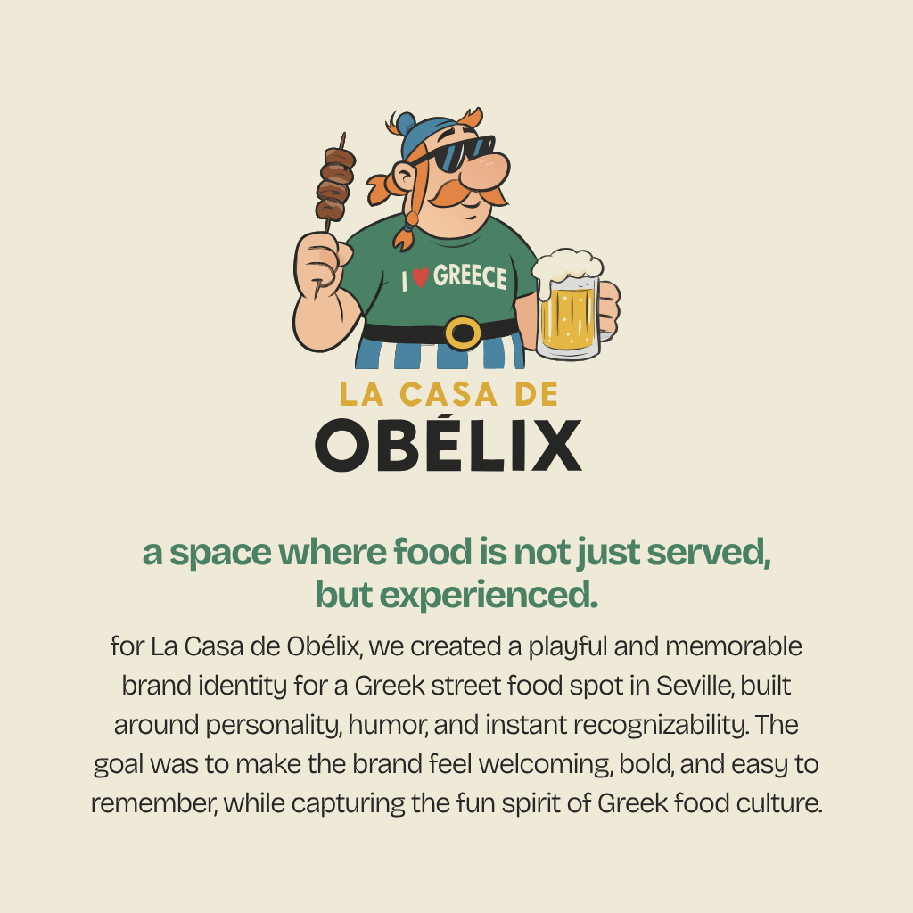
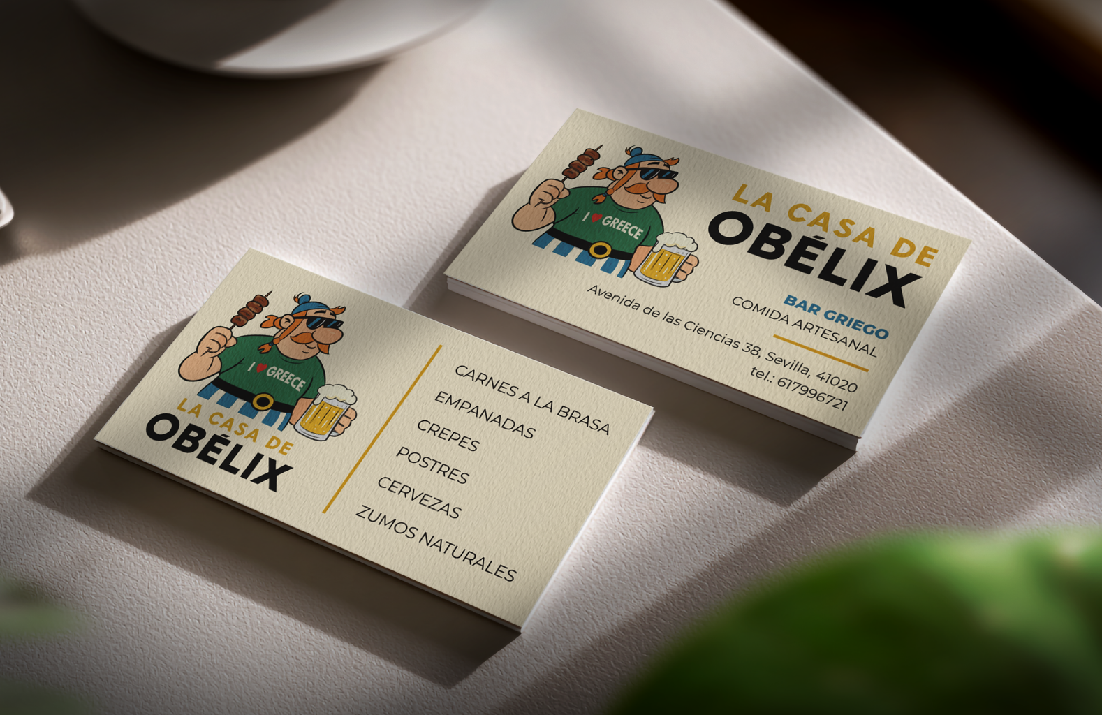
- Engineered a friendly, oversized, expressive cartoon mascot — pairing an iconic figure with playful modern details like sunglasses and an "I ❤️ GREECE" t-shirt to signal immediate approachability.
- Paired the custom character illustration with bold, rounded typography to build a high-visibility mark that holds its own in busy urban environments.
- Formulated the brand's core positioning line: "Manos de Grecia, Sabores de Leyenda" — Hands of Greece, Flavors of Legend — framing the restaurant's artisanal food focus.
02
custom color architecture
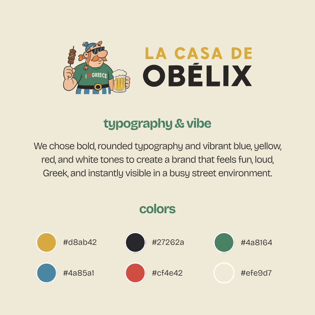
- Grounded the brand identity in a bright, Mediterranean-inspired palette that reads as fun, loud, and full of flavor before customers step inside.
- Systematized a clear six-tone palette for uniform cross-media application:
- #D8AB42 Vibrant Sun Gold and #CF4E42 Terracotta Red to stimulate appetite and energy.
- #4A85A1 Aegean Blue and #4A8164 Organic Green to anchor the authentic Greek identity.
- #27262A Charcoal Black for high-contrast typography, and #EFE9D7 Warm Cream as a soft, premium background canvas.
03
print & spatial signage
- Designed the physical touchpoints of the venue — high-finish textured business cards detailing the core menu offerings (carnes a la brasa, empanadas, crepes, postres, cervezas, zumos naturales).
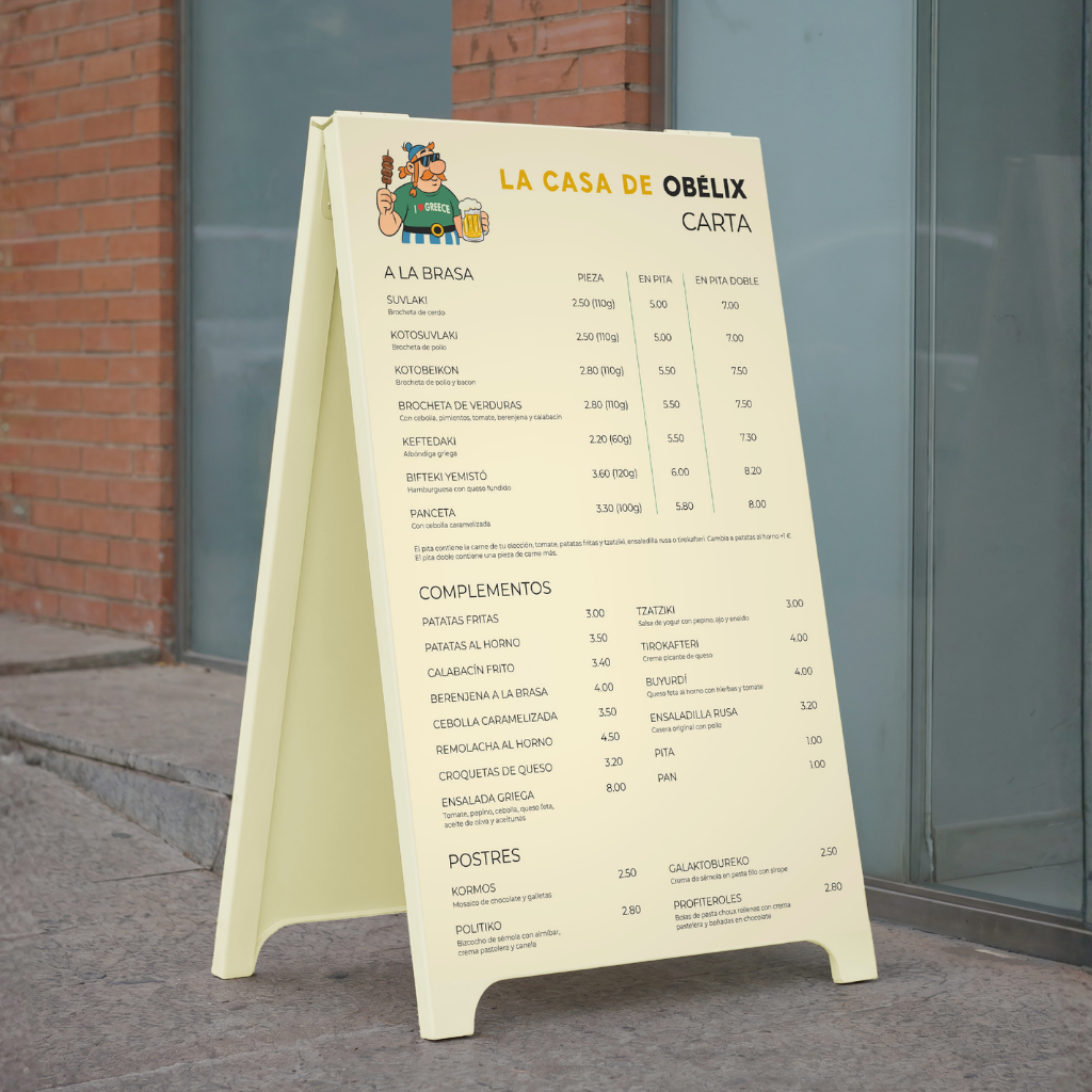
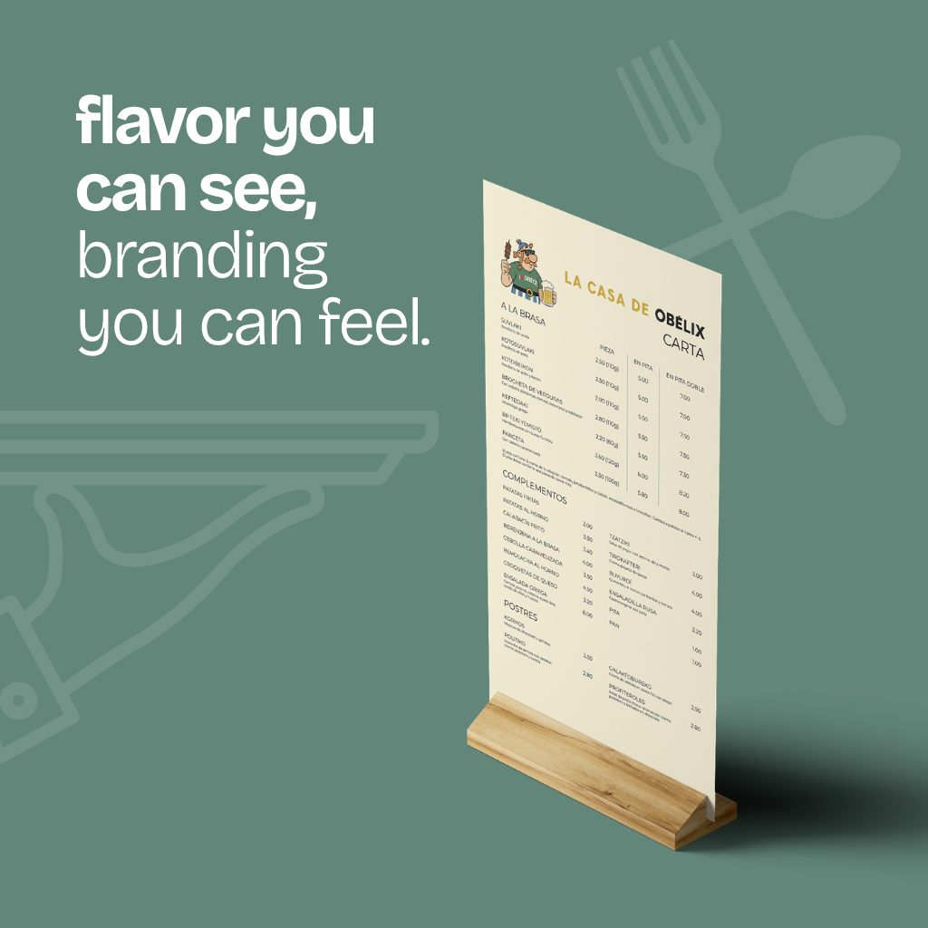
- Developed the outdoor menu system (carta A-boards) with clear typographic hierarchies designed for rapid roadside reading.
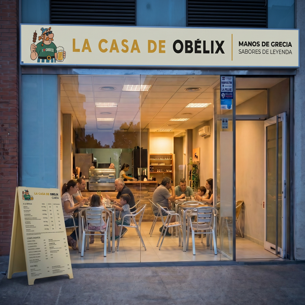
- Executed the main exterior storefront design, implementing a custom illuminated lightbox that anchors the property's presence at night.
- Carried the brand's signature humor into the interior — custom illustrated wooden bathroom signs that distinguish the hombres and mujeres spaces with playful props.
04
visual storytelling & always-on marketing
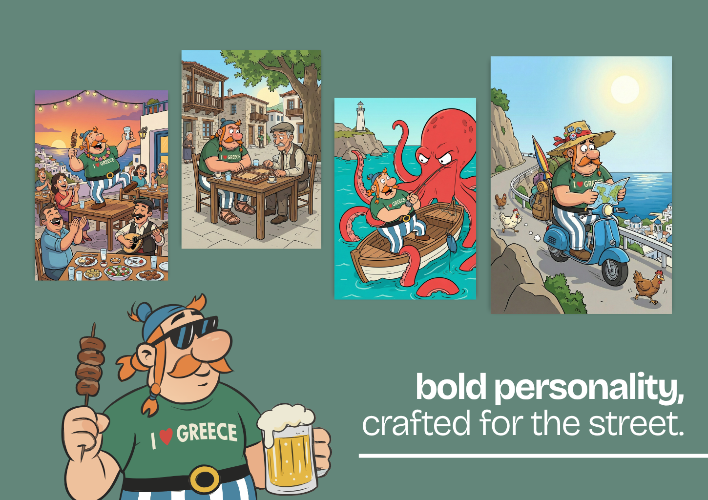
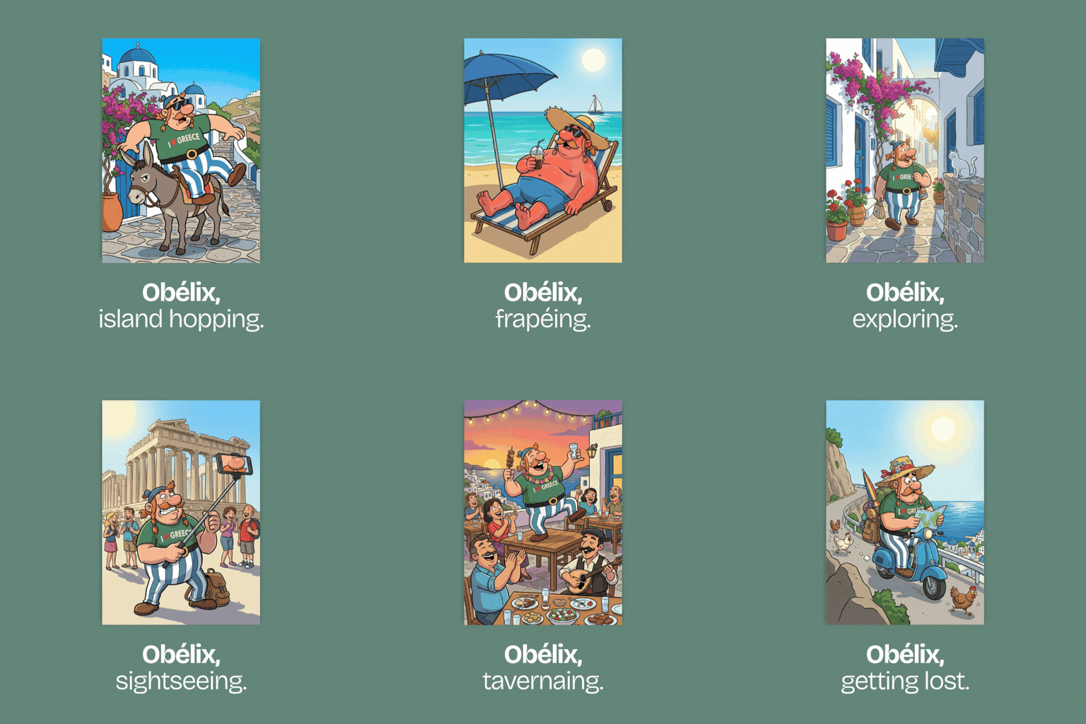
- Produced immersive narrative illustrations — including the custom cartoon scene of the mascot playing tavli in a Greek village square — as premium content assets across every digital channel.
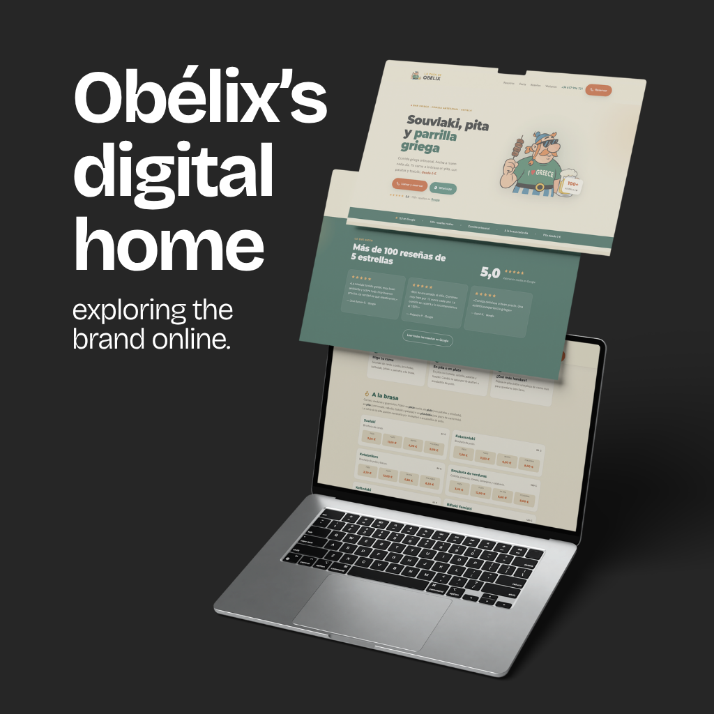
- Designed and deployed a fast, mobile-responsive website geared entirely for rapid menu exploration and clean local findability.
- Run the restaurant's always-on marketing — the social channels and the Google Ads program — keeping the taverna present in Seville's feeds and searches from opening week onward.
THE OUTCOME
building Seville's most unmissable, character-driven Greek street food experience.
6
BRAND TONES SYSTEMATIZED
100%
CUSTOM ILLUSTRATION LIBRARY
360°
PRE-LAUNCH TO ALWAYS-ON MARKETING
DELIVERABLES
NEXT CHAPTER
want a brand with real personality?
Let's build one that turns heads on the street and the feed.