
virus defense group
A one-page WordPress site for a Charleston disinfecting start-up in the summer of 2020 — a clickable homepage five days after kickoff, an illustrated icon set that grew to twenty-two, and a quote form that does the qualifying before anyone picks up the phone.
THE BRIEF
a new company, a nervous market, and no time for wireframes.
Virus Defense Group started in June 2020 in Charleston, South Carolina, spraying offices, gyms, restaurants and homes with a botanical, bleach-free, EPA-registered disinfectant through electrostatic sprayers — the kind of service every facility manager was suddenly searching for, with arenas and stadiums in its sights. The company had a name, the equipment and a shield being designed elsewhere; what it needed, fast, was a website that would make a serious subject feel clean and calm rather than clinical. The brief was to get a professional site up within weeks, built around white space, plain language and pictures instead of chemistry — and to keep it easy to change, because the product line was still moving.
WHAT WE DID
01
the site
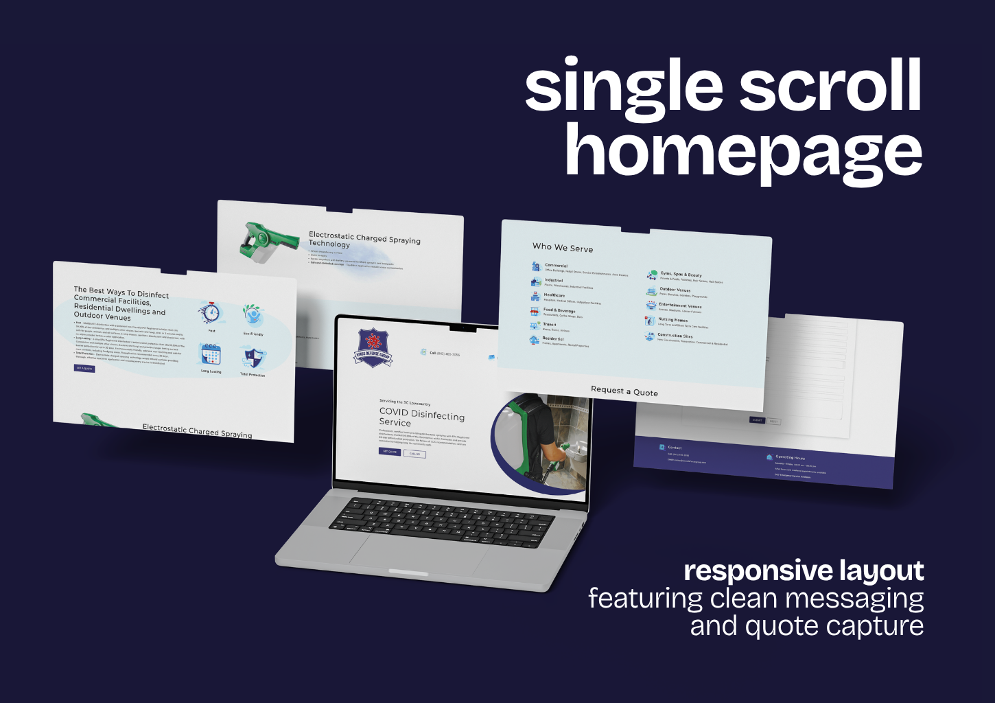
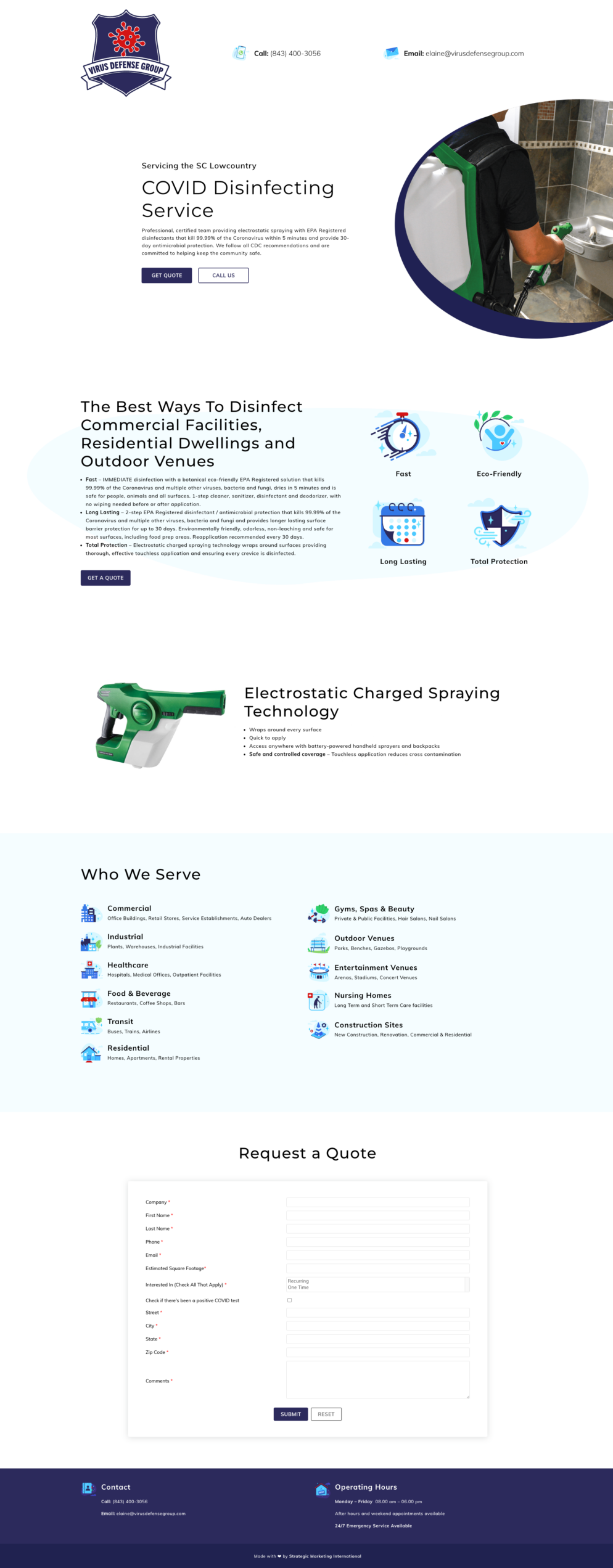
- Built the site as a single scroll — hero, the best ways to disinfect, the electrostatic technology, Who We Serve — set on white with the claims broken into icons, so a serious subject reads calm rather than clinical.
- Ended it with a quote form that does the qualifying — company and address, estimated square footage, recurring or one-time, a discreet check for a positive test on site — so the first reply back could carry a price instead of another question.
02
the build
- Drafted directly in WordPress instead of on paper — a clickable homepage on a staging server five days after kickoff — so the founders reviewed a working site on a call the next day and answered content questions in front of it.
- Kept the build open for a mark still being decided elsewhere — a placeholder in the header, a hero that could be re-cut — and had the site live that summer, with the quote form as its one call to action.
03
the icons
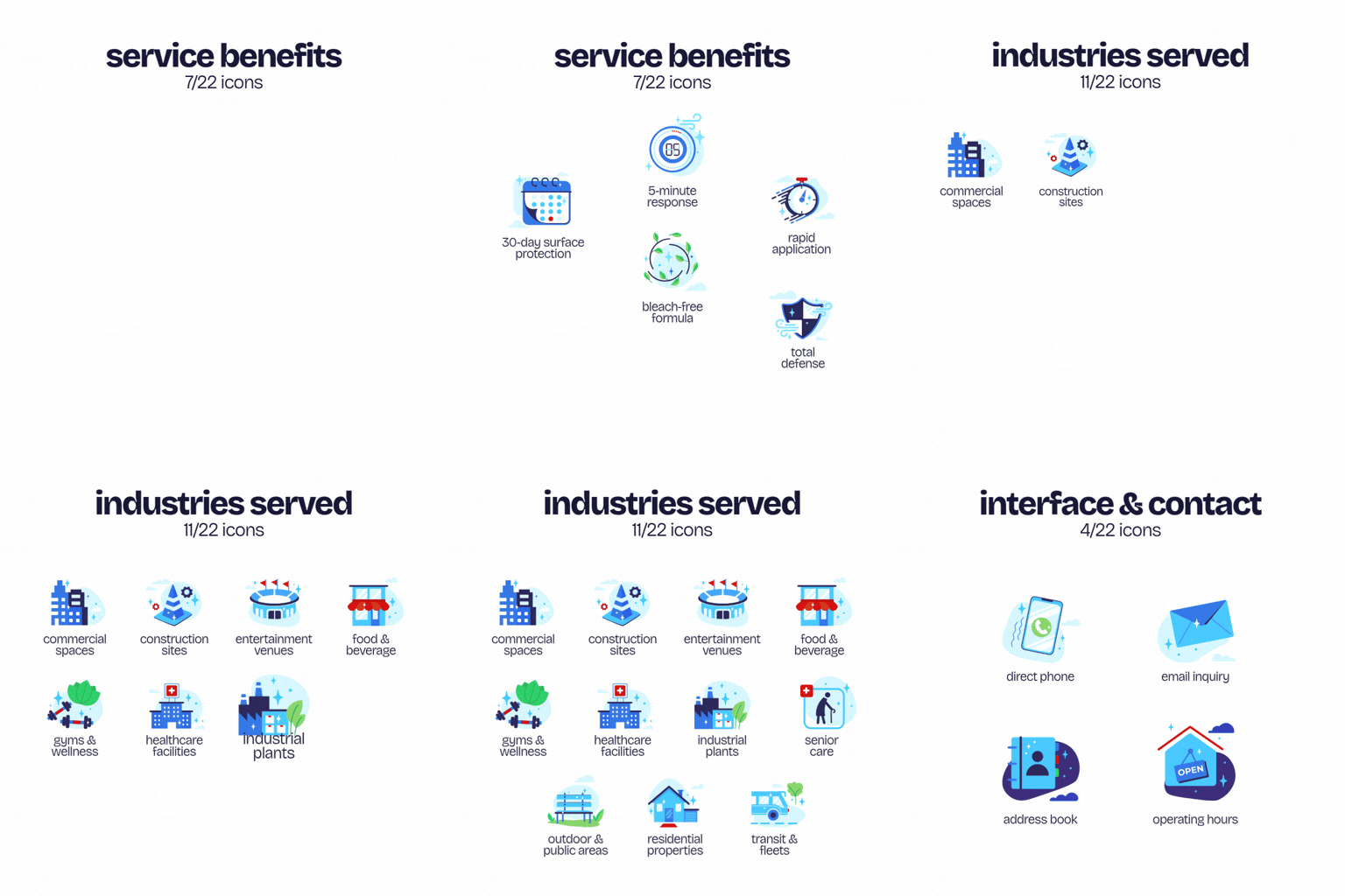
- Drew an illustrated icon set in one style — sky blue and navy with red accents and a leaf of green — for the benefits the service leads with and the eleven industries it serves, from healthcare and transit to gyms and construction sites.
- Kept drawing as the page changed — twenty-two icons in the end, the contact marks in the header and footer included — so every claim and every audience had a picture in the same hand.
04
the hero and the follow-through
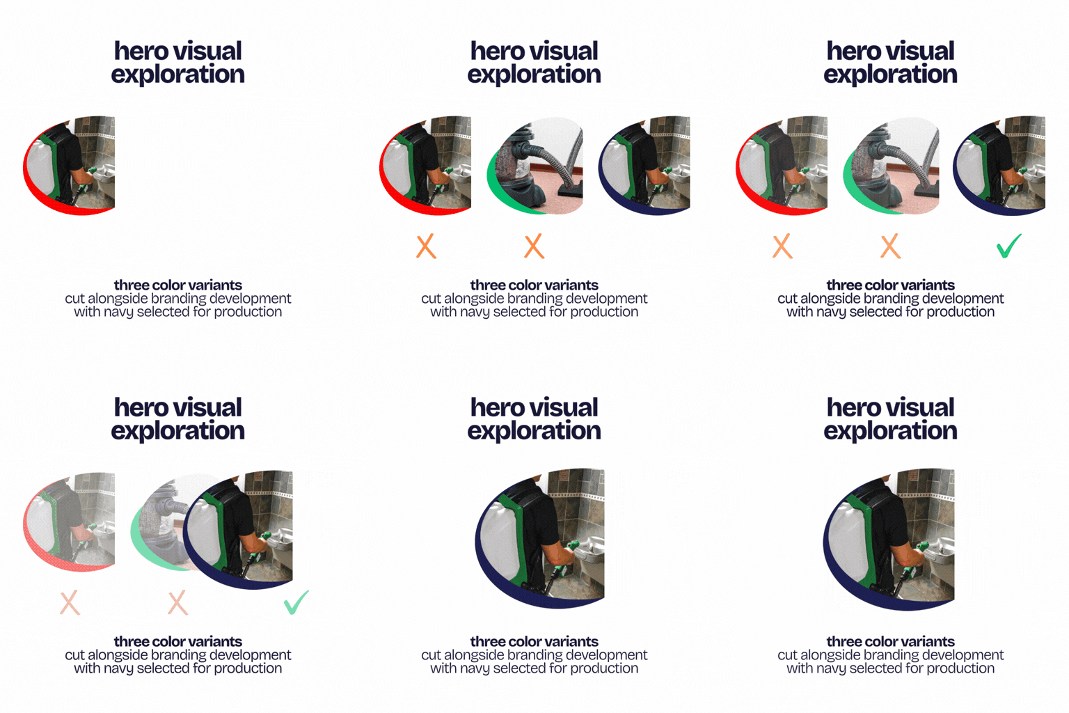
- Composed the hero as a photograph in a circle with a colored crescent and cut it three ways — green, red, navy — as the brand settled; the navy one shipped, matching the shield the client had chosen.
- Came back in September when a two-step, thirty-day protection product joined the line: the hero copy took in the thirty-day claim, a long lasting icon joined the benefits row in the same style, and the page grew without a redesign.
THE OUTCOME
a serious service that looked calm — and a homepage the founders could click in five days.
5
DAYS · KICKOFF TO A CLICKABLE HOMEPAGE ON STAGING
22
ICONS · ONE ILLUSTRATED SET, BENEFITS TO INDUSTRIES TO CONTACT MARKS
1
PAGE · THE WHOLE SERVICE ON ONE SCROLL, SPRAYER TO PRICED QUOTE
NEXT CHAPTER
need a site up in weeks, for a service people are searching for right now?
Let's draft it live, make it calm, and give every claim an icon.