
clean advantage
A sales kit and a seven-page website for a South Carolina contract packager — a pocket folder whose three inserts and card spell out what the company gives you, and a WordPress site cut from the plant's own film: a still for every page hero, loops behind the homepage, and two customer testimonials you can press play on.
CLIENT
Clean Advantage, Inc.
INDUSTRY
SERVICES
Extended
TIMELINE
Long (6+ months)
THE BRIEF
twenty-five years of filling other people's bottles, and nothing to hand a buyer.
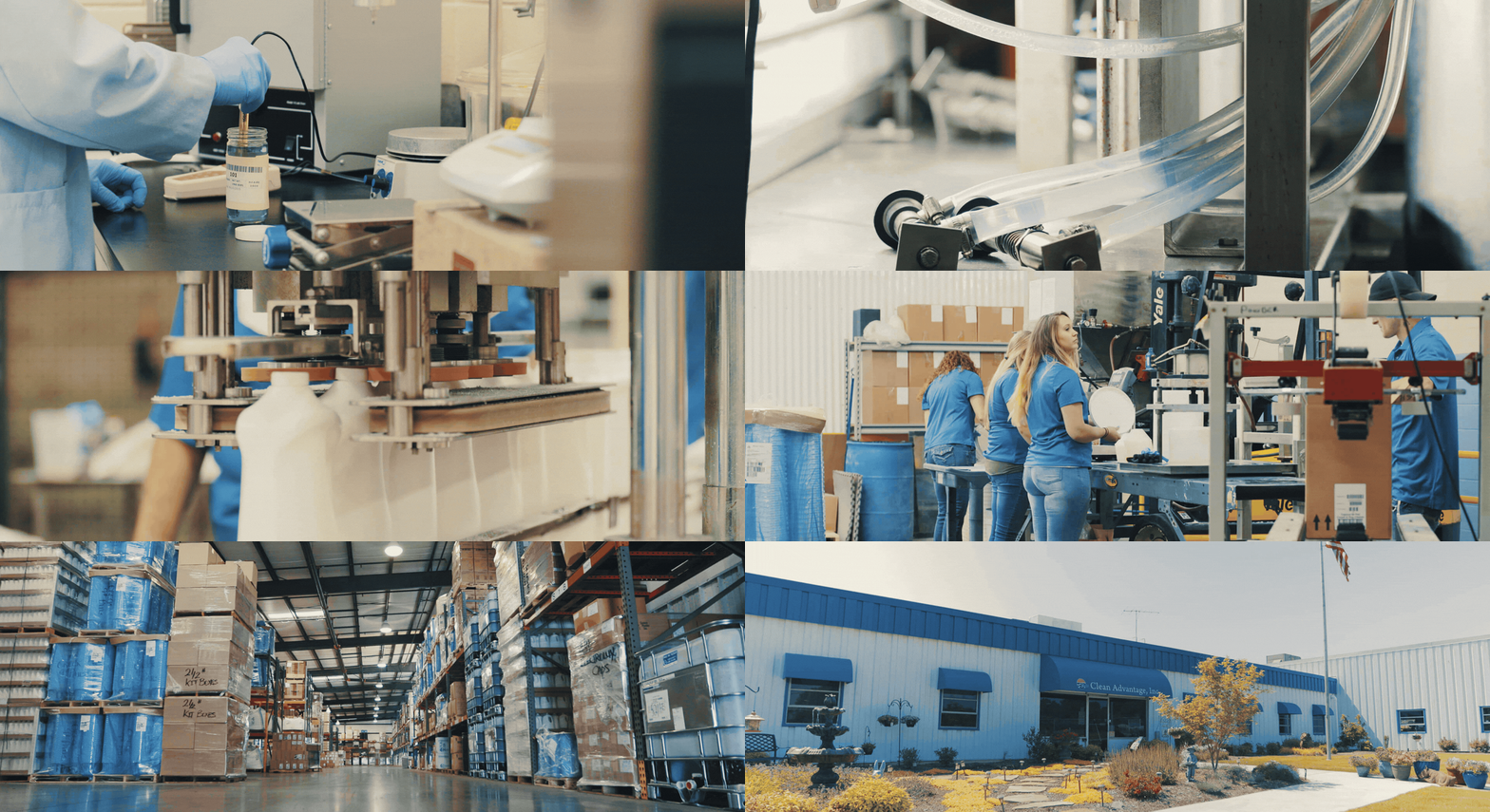
Clean Advantage is a contract packager outside Greenville, South Carolina. For twenty-five years it has blended, filled, labelled, boxed and shipped cleaning products that carry other companies' names — floor care for a textile giant, adhesives, powders, private-label lines — from a plant with nine liquid lines, three powder lines and a steam tunnel for shrink sleeves. It is a certified women-owned business, and its customers stay for decades. What it did not have, in the spring of 2017, was anything to show a new one. The company had a mark it had used for years, a tagline, and a film of the plant already being shot; it needed the two things a sales call and a search result run on — a folder a rep can leave on a desk with the right sheet inside, and a website that put the plant itself in front of buyers who would never visit it.
WHAT WE DID
01
the kit
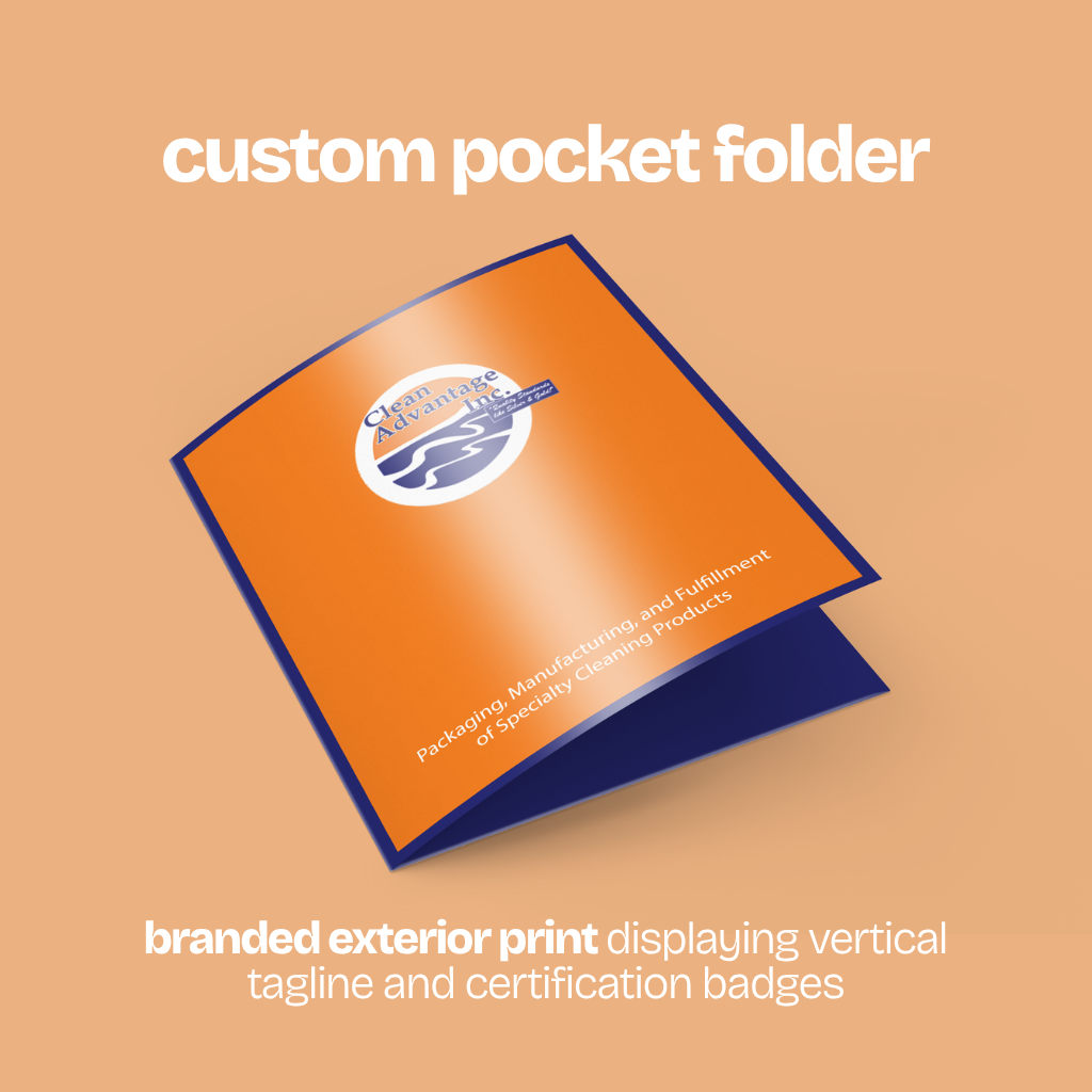
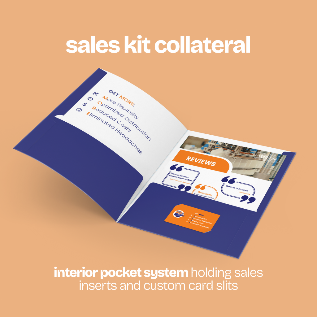
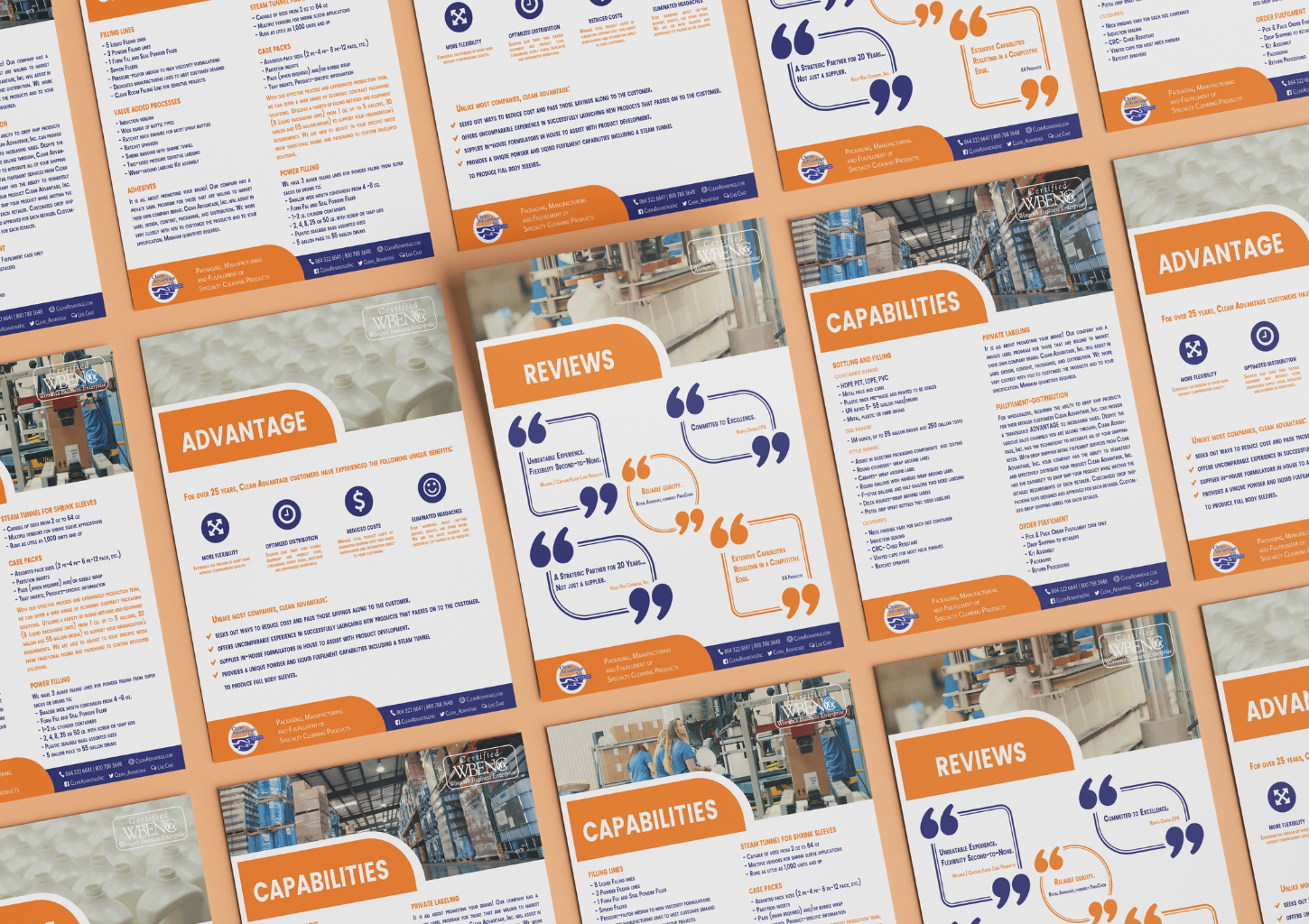
- Designed a pocket folder in the mark's own orange and navy — tagline tall down the cover, certification badge in the corner — with three inserts to restack for every call: Advantage, a two-sided Capabilities sheet, and Reviews, five customer quotes inside outsized quotation marks.
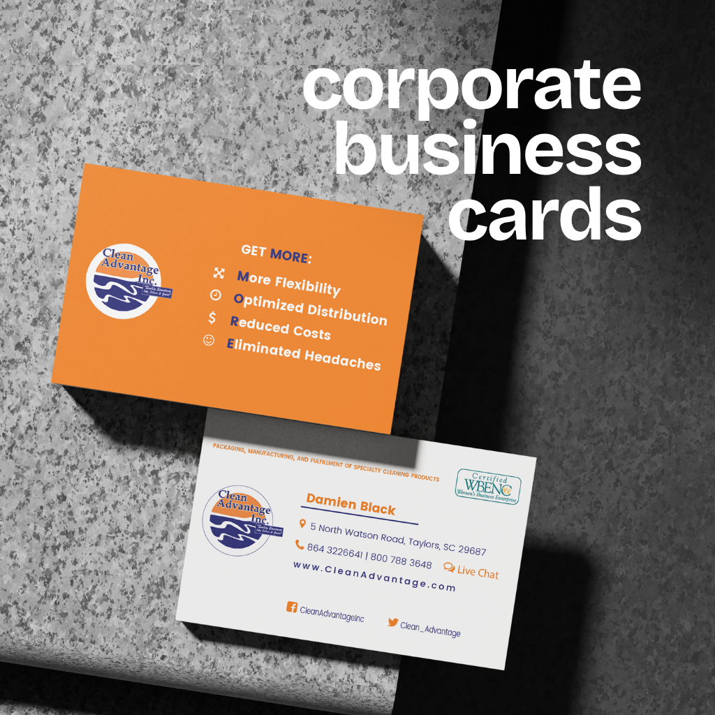
- Turned the four benefits into a device the kit repeats: More Flexibility, Optimized Distribution, Reduced Costs, Eliminated Headaches, initials in a second color so the list reads MORE — each with an icon, inside the folder and on the back of the card.
02
the site
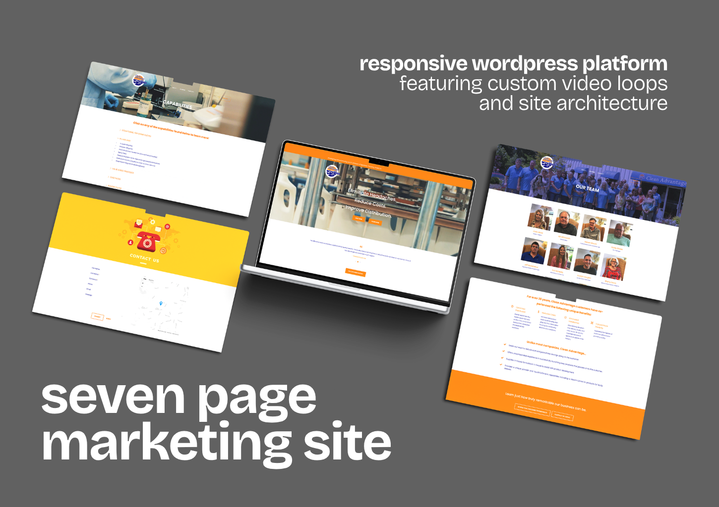
- Built a seven-page WordPress site on the folder's plan — Advantage; Capabilities as an accordion of ten services; a team page, ten portraits in the same chair; reviews; a virtual tour; contact with a map and live chat — so a buyer finds online what the rep left behind.
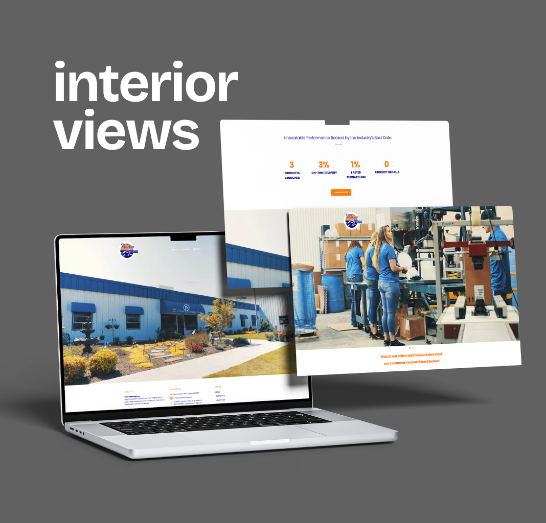
- Set the homepage to sell in one scroll: the tagline over footage of the line, a rotating customer quote, a strip of delivery figures, the plant under its flag, and a carousel of the brands it packs for.
03
the film, cut for the web
- Took the plant film the client had commissioned and made it do a photoshoot's work: eight cuts — three short loops for the homepage, a muted version behind the hero, the tour, two customer testimonials — each encoded twice, so it played in every browser of the day.
- Pulled seven stills from the footage and cropped each two ways, for heroes and wide bands; squared ten portraits and fifteen customer logos to one size; retouched what needed it — so every page opened on the plant itself.
04
one system, print to screen
- Carried one set of decisions across both: orange and navy lifted from the client's mark, one typeface for inserts and screen, the four benefit icons, the tagline as a bar above the site and a line down the folder, the reviews on paper and behind a play button.
- Kept the site sound after launch — search metadata and indexing, SSL on every page, the team page and contact details current as people changed — so the folder and the site stayed the same company.


THE OUTCOME
a folder for the desk, a site for the search — and the plant in both.
7
PAGES · THE PLANT ONLINE, FROM ITS FILLING LINES TO ITS PEOPLE
5
PRINT PIECES · A POCKET FOLDER, THREE INSERTS AND THE CARD
1.03s
HOMEPAGE LOAD · A VIDEO HERO, FASTER THAN 89% OF SITES TESTED
NEXT CHAPTER
got a plant worth showing, and nothing to show it with?
Let's build the folder for the desk and the site for the search — and put the place itself in both.