
simply aroma
A minimalist, typographic brand identity and sensory-driven packaging system designed to elevate everyday home care.
CLIENT
Astor Hellas
INDUSTRY
SERVICES
Full Spectrum
TIMELINE
Medium (3-6 months)
THE BRIEF
distilling fragrance into a timeless visual signature.
Simply Aroma approached Kronikon to design a clean, upscale brand identity and packaging architecture for their new line of home air fresheners. Moving away from the loud, chaotic graphics typical of traditional supermarket aerosols, they required a premium, calm aesthetic that focuses on clarity. The challenge was to build an enduring typographic system that functions beautifully across a diverse, growing portfolio of scents without losing its high-end editorial feel.
WHAT WE DID
01
brand identity
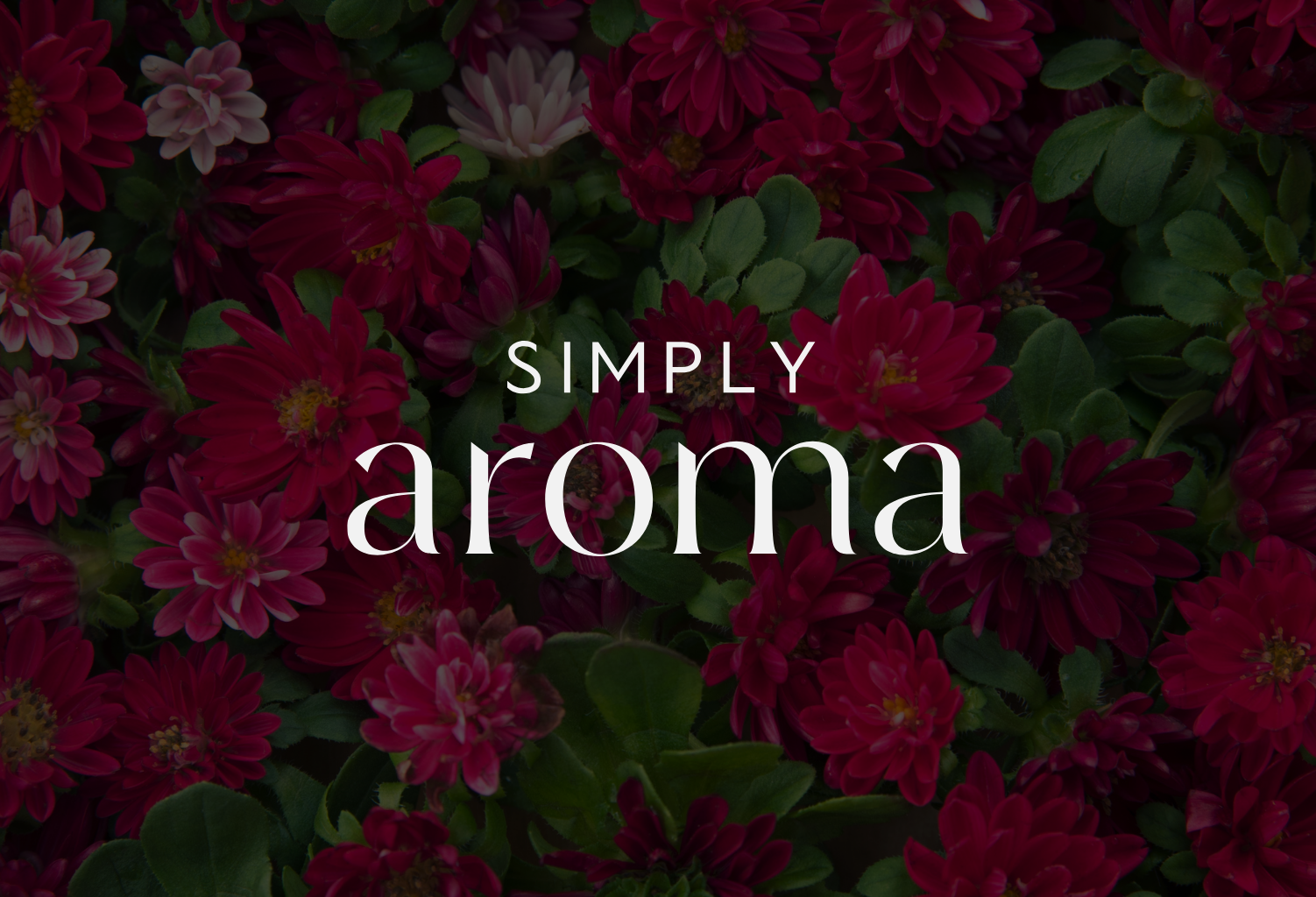
- Developed a purely typographic and minimalist logo designed to function as a literal "stamp" of quality across every product variety.
- Enforced a strict, monochrome typographic system to guarantee long-term timelessness and flawless legibility.
- Designed the brand marks to sit quietly and confidently on the label, letting the visual essence of each fragrance claim center stage.
02
packaging & label design
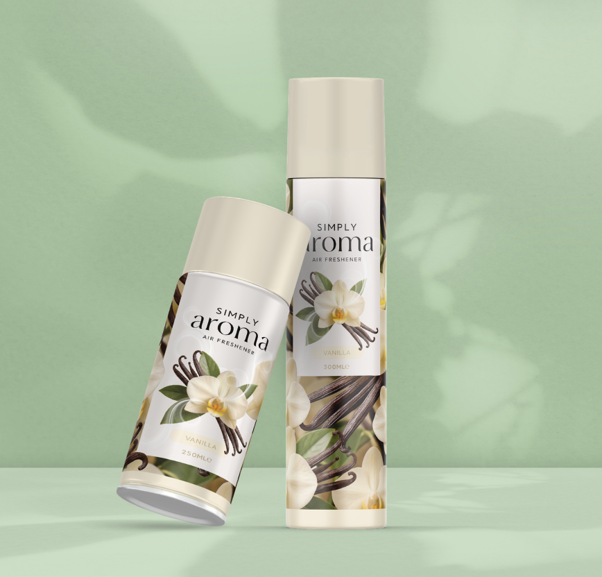
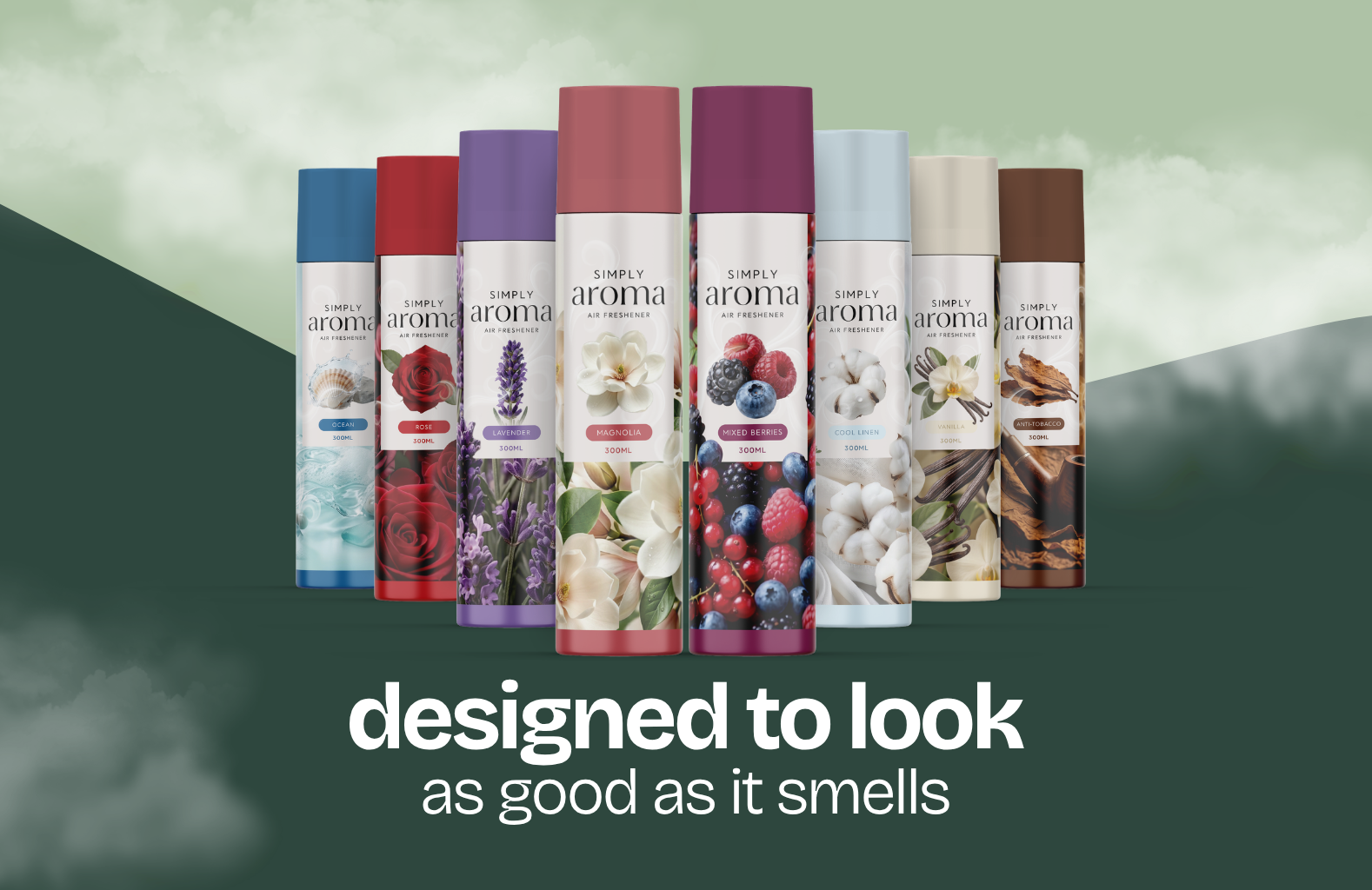
- Engineered a clean, adaptable packaging grid scaled perfectly for both 250ml automatic spray canisters and 300ml aerosol bottles.
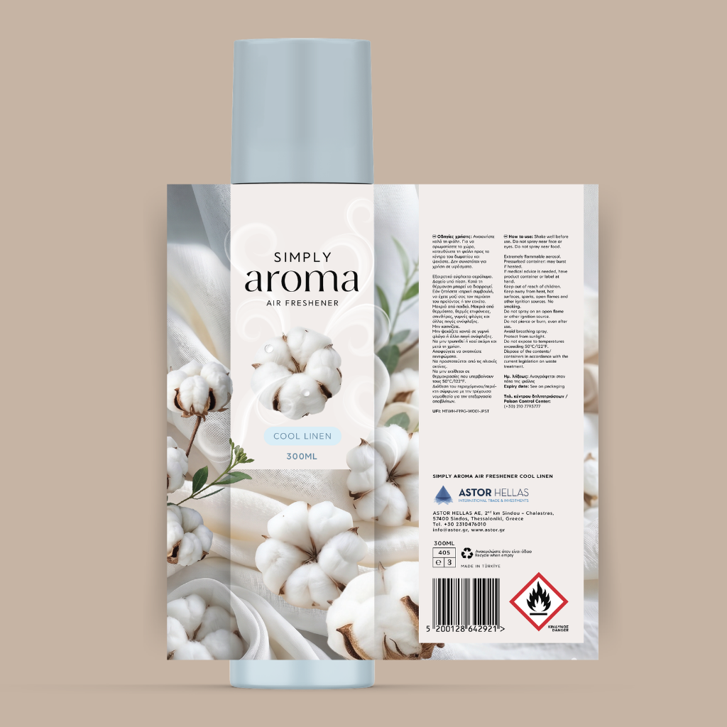
- Systematized a clean white front panel for the brand core, while neatly organizing safety indicators, instructions, and barcode components on the reverse side.
- Ensured high contrast and production readability across matte surfaces.
03
art direction
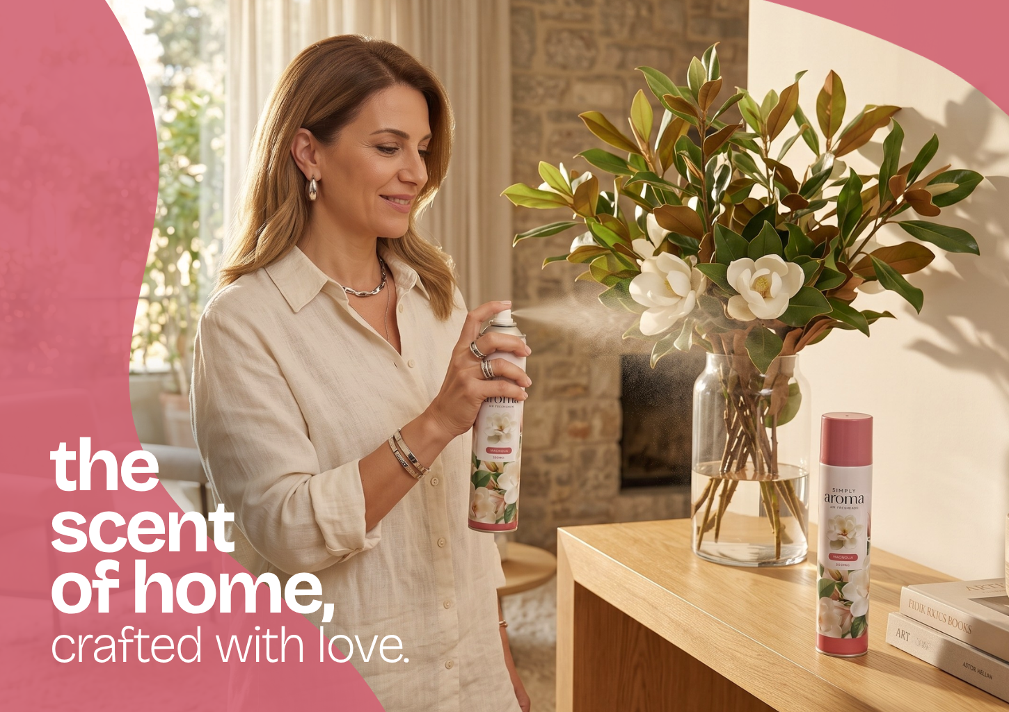
- Curated a rich, emotive photographic language for individual scents, selecting tactile imagery that communicates emotional depth directly to the consumer.
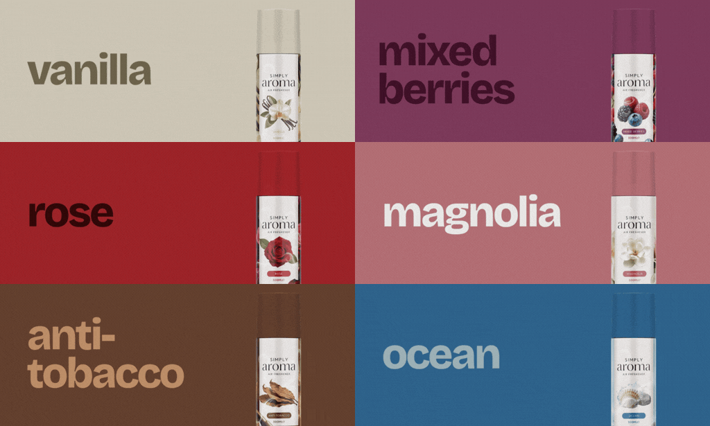
- Established a coordinated color framework where each product line—Ocean, Magnolia, Rose, Vanilla, and Anti-Tobacco—features a dedicated color-matched cap and base wrap.
04
color system & guidelines
- Grounded the core brand strictly in black (#131313) for typography, white (#FFFFFF) for negative breathing space, and an understated gray (#E1E1E1).
- Expanded the identity dynamically with soft, matte watercolor-style tones extracted from the specific botanical profile of each scent.
- Formulated these parameters to ensure the overall brand remains premium and cohesive, while individual products retain unique character.

THE OUTCOME
elevating essential home care with premium
typographic restraint.
9
FRAGRANCE LINES LAUNCHED
16
SKUs with 100% typographic consistency
1
quality seal: monochrome mark, nine fragrances
NEXT CHAPTER
got a brand to build?
Let's create something unmistakable together.