
my comfy
A year of work on a Charleston alpaca brand's Shopify store — a catalog that had outgrown its own shelves cut into ten collections, twenty-one storefront graphics drawn to dress them, wholesale prices put back in front of the right customers, and a redesigned logo to sign it all.
CLIENT
My Comfy · Latin Collection LLC
INDUSTRY
SERVICES
Extended
TIMELINE
Long (6+ months)
THE BRIEF
everything they made, in one long list.
My Comfy is the alpaca line of a Charleston company that has been importing and making alpaca goods for years — socks knitted for hiking and for hospital floors, baby-alpaca scarves and shawls, throws and blankets, ponchos and ruanas, gloves and headbands, and the fluffy alpaca figures people buy as gifts. By early 2020 the Shopify store had grown into one long list: every product on a single page, with nothing to separate a shopper looking for compression socks from a wholesale buyer placing a trade order. Rebuilding the store from scratch would have cost a season and thrown away a theme that worked, so the brief was to keep the theme and reorganize everything in front of it — the catalog, the navigation, and the graphics that dress the shelves.
WHAT WE DID
01
the shelf plan
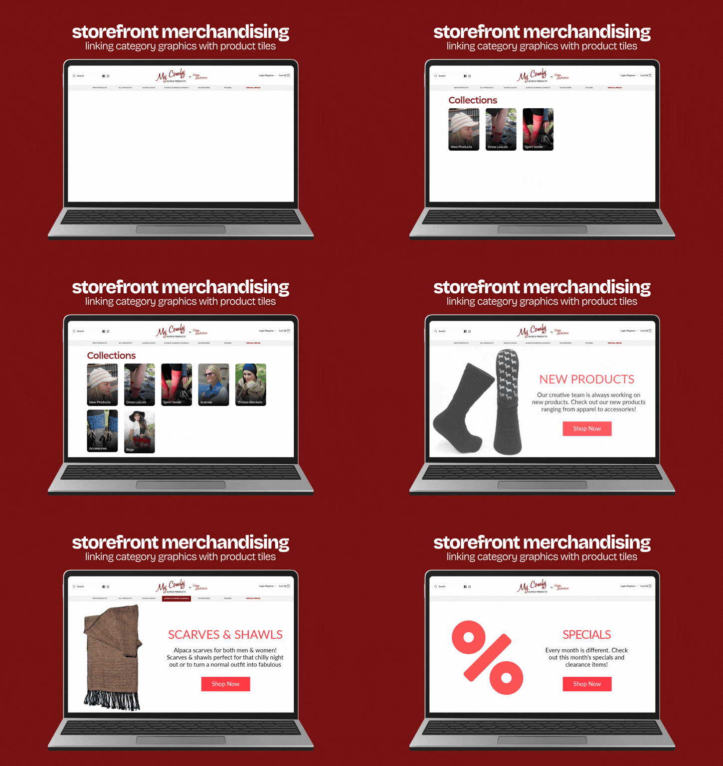
- Reorganized the catalog into ten collections cut the way people actually shop — socks, scarves and shawls, throws and blankets, accessories, bags, baby, children, dress and leisure, sport, and the alpaca figures — then rebuilt the navigation as nested menus over them.
- Kept the store's existing theme and worked inside it, so the season that a rebuild would have cost went into merchandising instead, and nothing the client already knew how to run had to be relearned.
02
the storefront
- Drew twenty-one graphics to dress the new shelves: three rotating home banners, a photographic tile for every collection, and eight category cards that pair a product cut out on white with a line of plain copy and a Shop Now.
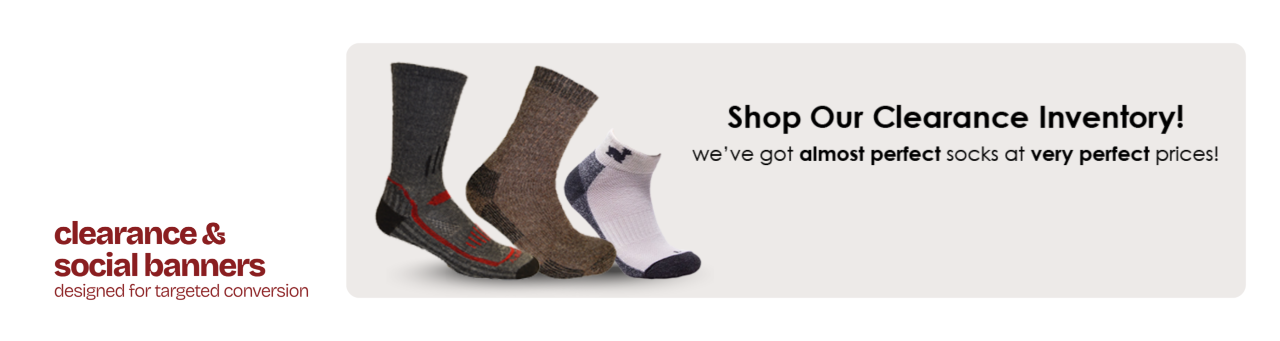
- Added the pieces a shop needs around the edges — a clearance banner for the almost-perfect stock, seasonal exclusives, and a social promo inviting people to message for a sock recommendation and a monthly code.
03
search and the wholesale side
- Set up the store's search so a catalog this size could be found rather than scrolled — results grouped, sorting made sensible, the data behind it cleaned out and rebuilt when the index went stale.
- Traced the wholesale prices that had stopped showing to a collision between the theme and the pricing app, and held three vendors in one conversation until trade customers saw their prices again.
04
the logo
- Redesigned the My Comfy logo in four directions — upright, inclined, simplified, with the alpaca tucked into the script — so the brand chose its new mark from finished alternatives.
- Resolved it into one logo that reads as a brand in its own right while staying endorsed by the parent, and cut it for the web at the sizes the storefront actually needed.

THE OUTCOME
a catalog you could finally shop — and a shelf plan that outlived the theme it was built in.
10
COLLECTIONS · THE CATALOG CUT THE WAY PEOPLE SHOP IT
21
STOREFRONT GRAPHICS · HOME BANNERS, COLLECTION TILES, CATEGORY CARDS
3
VENDORS HELD IN ONE CONVERSATION · WHOLESALE PRICES BACK ON THE PAGE
NEXT CHAPTER
more products than your store can show?
Let's cut the catalog the way people shop it — and dress the shelves so it sells.