parkotech
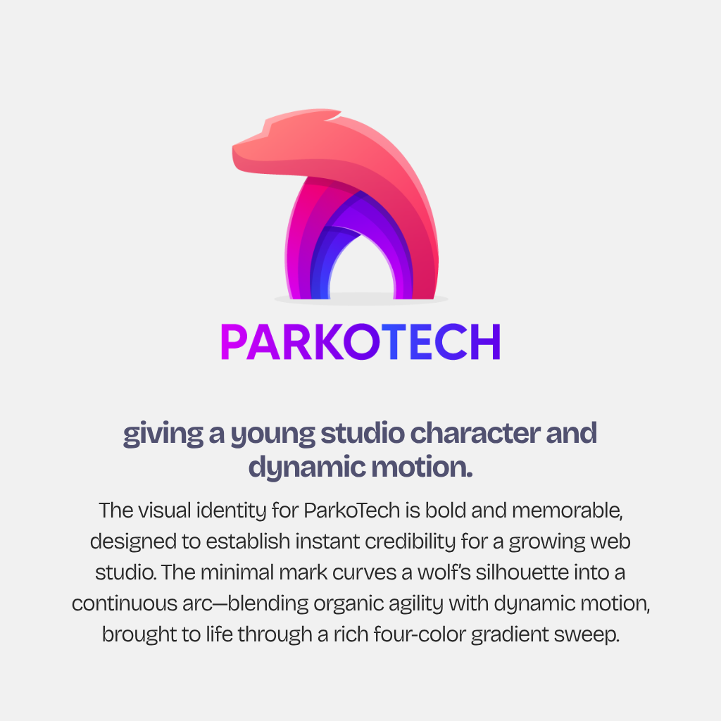
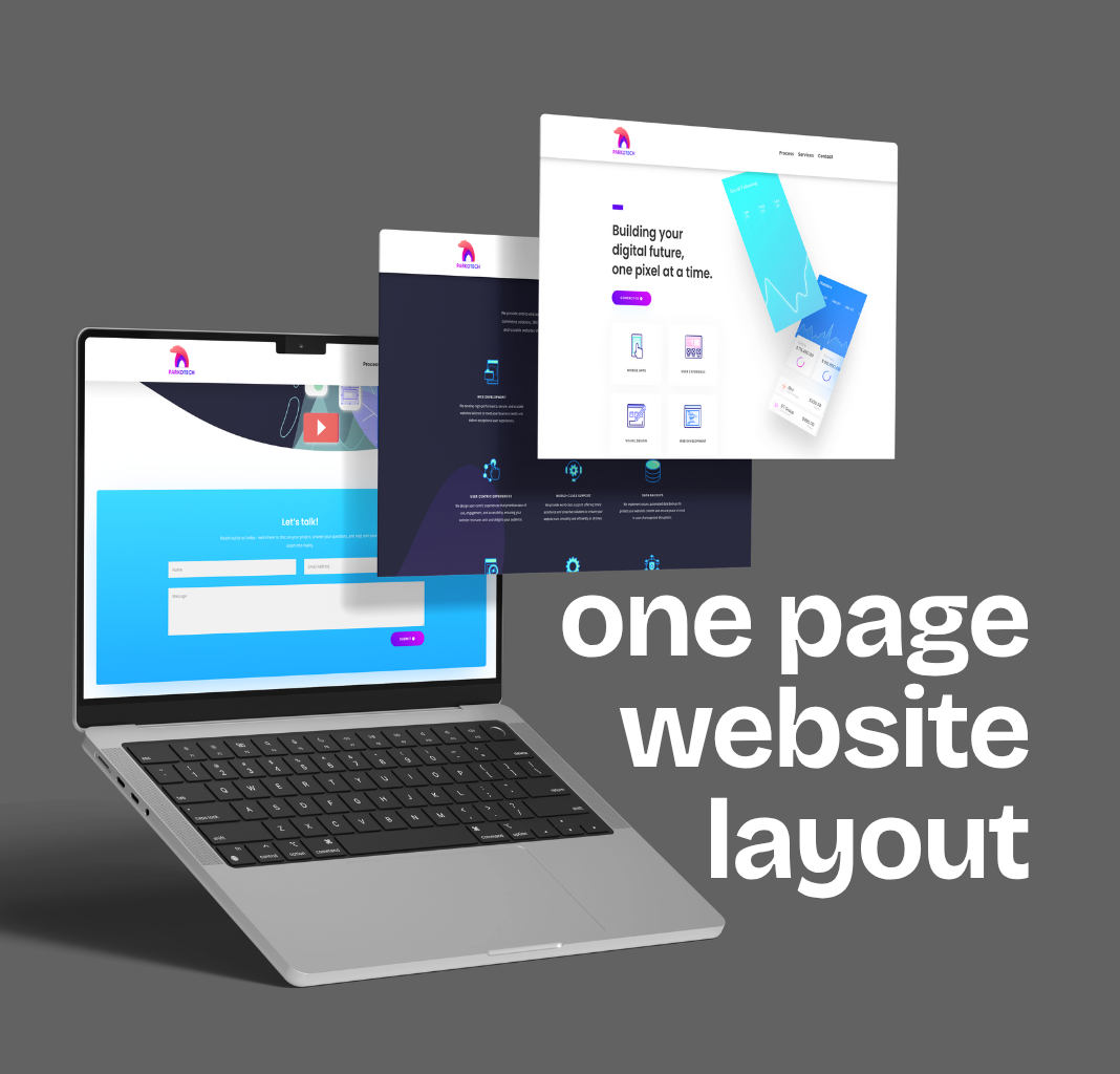
A launch identity and a one-page website for a young web-development studio — a wolf-in-an-arc mark in a four-color gradient, and a site that walks a prospective client from process to services to contact without a single page change.

THE BRIEF
a studio that builds websites, given a face and a front door.
A web-development studio has an awkward first job: it has to look like the kind of company it wants to build for. ParkoTech was starting out with a clear offer — websites, apps, backend work, and the support to keep them running — and nothing yet to show for itself. The brief was the two things a studio needs on day one: a mark with enough character to be remembered, and a single, confident page that explains how the studio works, what it builds, and how to start a conversation.
WHAT WE DID
01
the mark
- Designed the ParkoTech identity around one gesture — a wolf's head that curves into an arc — so the mark reads as both a creature and a motion, drawn once and holding from the favicon up to the hero.
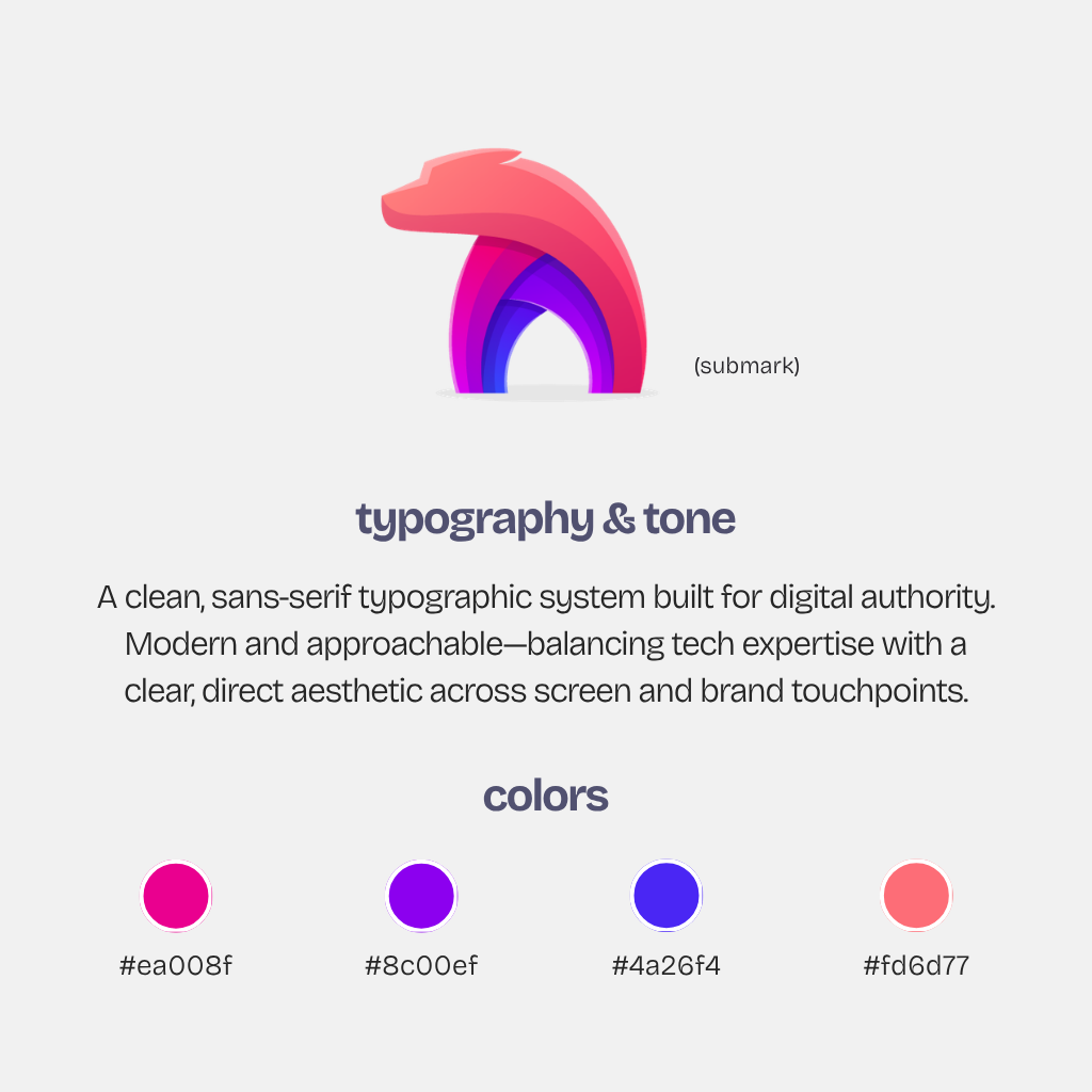
- Set it in a four-color gradient, coral through magenta and violet to blue, and carried the same sweep into the wordmark, so the name and the symbol share one energy.
02
the one-page site
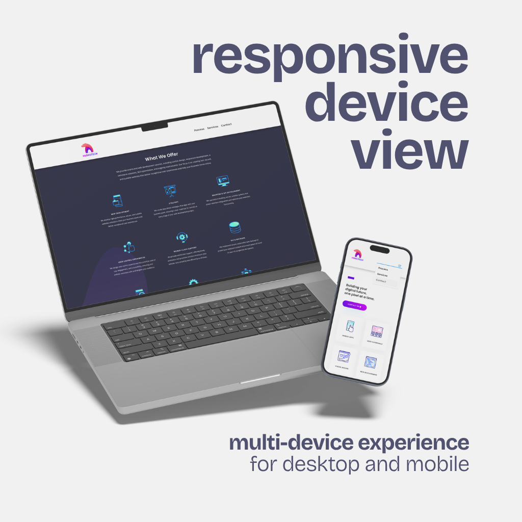
- Designed and built the studio's site as a single scroll on WordPress — the offer up top, then the four-stage process, the industries it builds for, the services, and a contact form — everything a prospect needs in one continuous read.
- Composed it in the mark's own palette, with the anchor navigation (process · services · contact) doing the work of a whole site map, so the page feels complete rather than small.

THE OUTCOME
a studio with a face — and a page that says the rest.
1
PAGE, THE WHOLE PITCH · PROCESS → SERVICES → CONTACT
4
COLORS IN ONE ARC · CORAL · MAGENTA · VIOLET · BLUE
4
PROCESS STAGES, WALKED IN ORDER · ROADMAP → DESIGN → BUILD → LAUNCH
DELIVERABLES
NEXT CHAPTER
starting a company that needs to look like one on day one?
Let's design the mark and the page — and get you a front door in a month.