
kafasi
A brand upgrade and a launch landing page for a Greek producer-to-consumer marketplace — two clashing logos unified into one crate mark, ready for the app's debut.

THE BRIEF
giving a marketplace one face in time for launch.
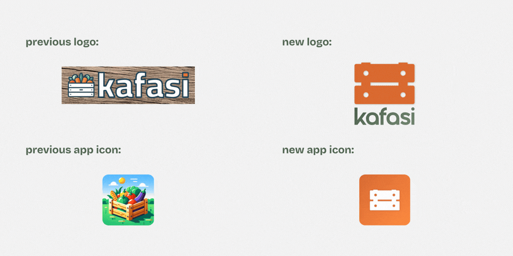
Kafasi connects local Greek producers directly with the people who buy from them — a marketplace on both an app and the web. The team had built the product themselves and carried it nearly to launch, wearing every hat along the way — including the brand's. On that road the identity had split in two: a detailed, illustrated produce crate on the app and a flatter wordmark on the website — two marks telling the same story differently, and neither drawn for the small sizes a brand actually lives in, from the app icon to a social avatar. With launch approaching, they handed the public face to specialists: unify the identity into one clean, scalable crate mark that says fresh, straight from the producer, and rebuild the landing page that has to turn a visitor into a user.
WHAT WE DID
01
one mark, from two
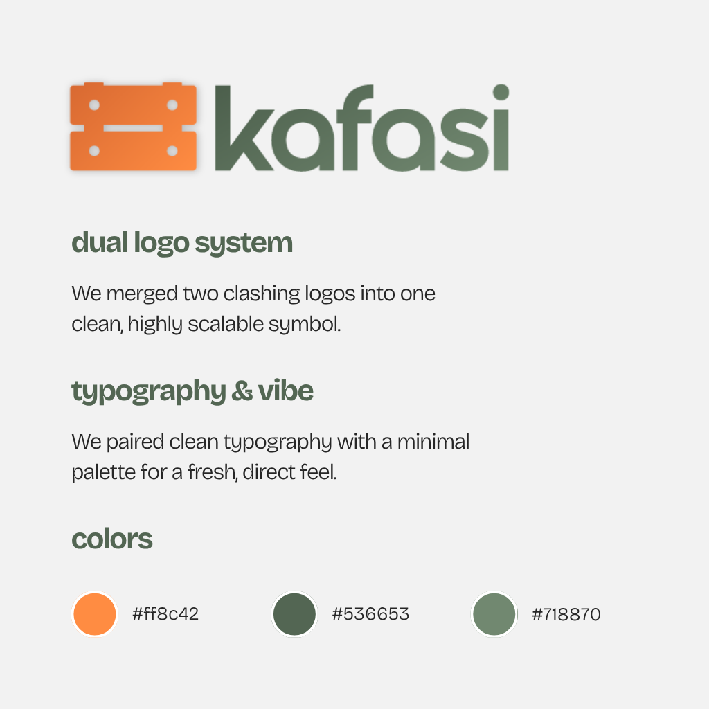
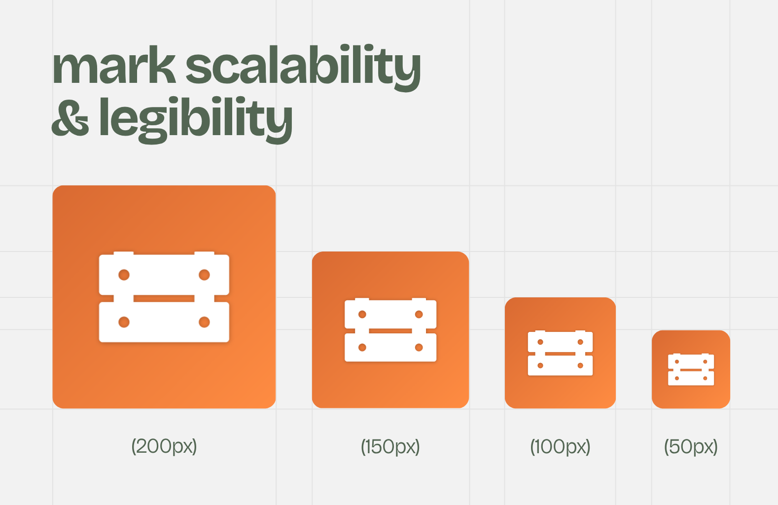
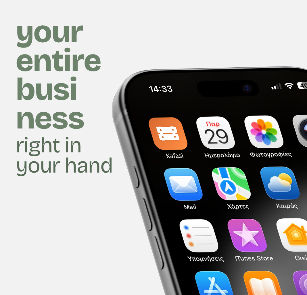
- Unified the app's illustrated crate and the website's wordmark into a single crate symbol — clean, geometric, and legible from an app icon up to large format.
- Built it out as a working system — symbol, wordmark, and horizontal lockups in full-color and reversed — so the brand reads the same across app, web header, social, and print.
- Held onto what the marketplace is: the freshness and the human, friendly tone, now in a mark that says producer to consumer at a glance.
02
the launch landing page
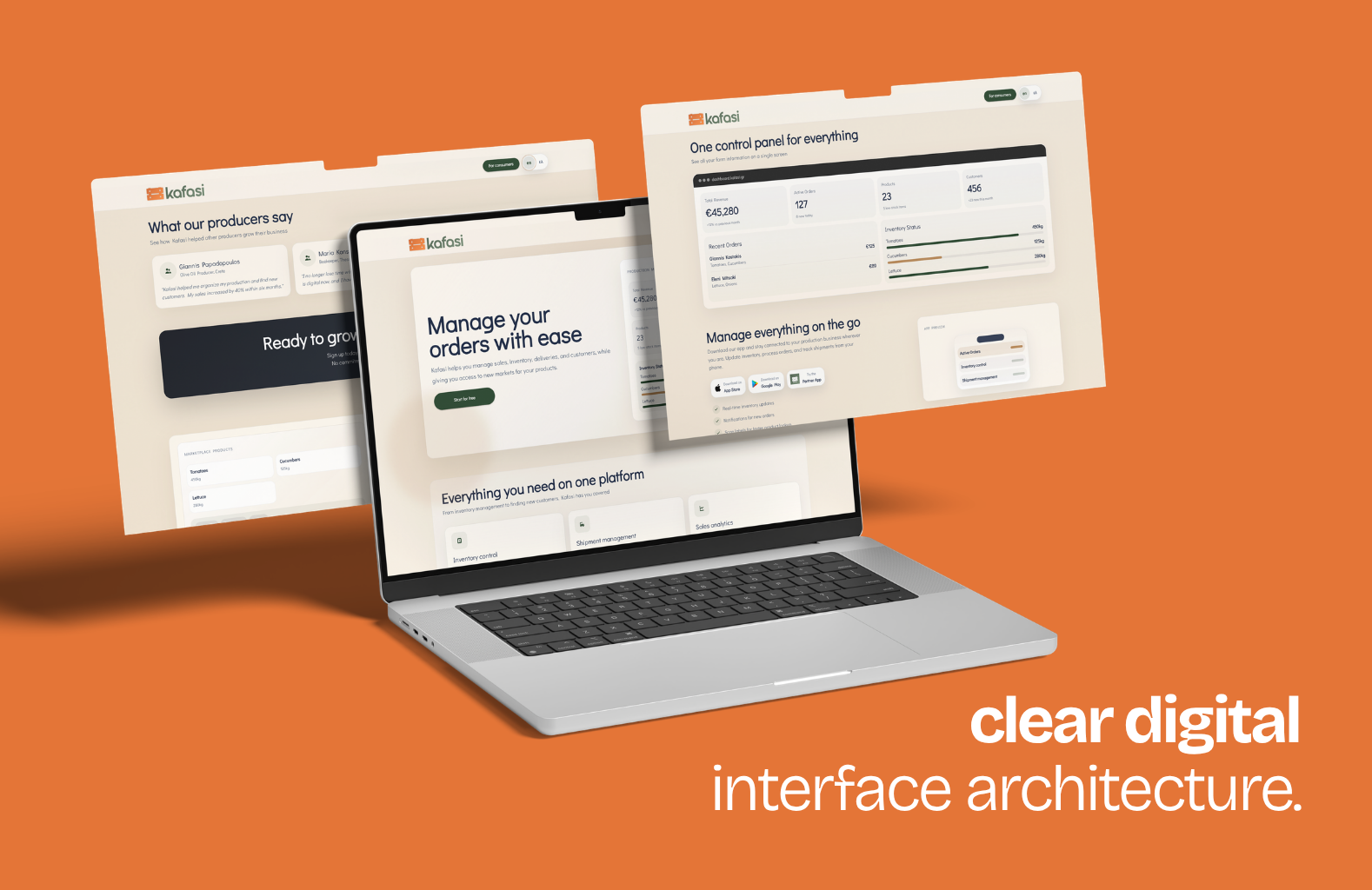
- Took the landing page off the founders' plate and rebuilt it as a clear, considered composition — the page the launch depends on.
- Structured it to carry a visitor from the promise the mark makes to the reason to join, ready for the app to go live behind it.



THE OUTCOME
one identity, ready for the day the app went live.
2 → 1
TWO CLASHING LOGOS (APP + WEB) UNIFIED INTO ONE MARK
4
SURFACES, ONE SYSTEM · APP · WEB · SOCIAL · PRINT
100%
OF THE PUBLIC FACE — BRAND & LANDING PAGE — READY FOR THE DEBUT
NEXT CHAPTER
is your brand pulling in two directions?
Let's make it one — a mark that works everywhere you do, in time for launch.